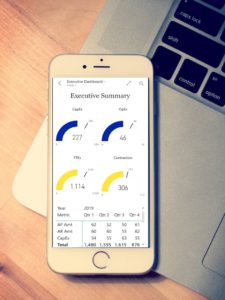
Improve Healthcare Analytics with Dashboards
Regardless of your specific role in the healthcare arena. Using dashboards for data and analytics will improve your ability to make data driven decisions. Dashboards are graphical views of your data that focus on Key Performance Indicators (KPIs) and metrics that are critical to the success of your organization. There are several types of standard dashboards such as Financial, Operations, Sales, Clinical, or Claims. When you want to get more value from your data, start with a simple dashboard that surfaces the 5-10 critical metrics for your company. You can always expand later, but start small and get value from your investment as quickly as possible. Often, I do this in weeks not months. This should not be a prolonged project, getting value quickly is the goal.
Here are 3 ways to Improve Healthcare Analytics with Dashboards
1 – Accessibility of Data
Dashboards enable everyone access the data on their computer, tablet, or phone. They eliminate the need to login to various systems to pull reports and merge data in Excel to get to a final number. I often find companies struggle with management not being able to easily get the data they need to know how their area is performing. All of the data is in the system but not readily available to be used as information. Implementing dashboards automates the data processing and converts the data into easy to use graphics and metrics with reliable products like Microsoft’s Power BI. Using an app on your phone you have access to your data wherever you are.
2 – Focus on Critical Metrics and KPIs
Now that everyone can access the dashboards. You can ensure they are all using the same information to improve your company. I often find key metrics for a organization are found on multiple reports. This can lead to data confusion, when multiple departments submit reports on the same metric with different results.
For instance, an insurance company needs to know the number and amount paid on claims. What is the paid claim amount? Is it the status in the system that says the claim should be paid or is it the actual date that the money was moved from the company to pay the claim? Both are correct in certain contexts. If you use Claim Paid Amount based on the bank transaction on your dashboard. Then everyone knows exactly the impact to the company. This is one example, of how to use dashboards to ensure your team is focused on the critical metrics required for improving your organization.
3 – Receive Alerts on KPIs and Metrics
Once you are focused on the critical metrics of your organization. Individuals can setup alerts that are triggered when a metric exceeds or falls below a threshold. This eliminates the need to continuously run reports to see how you are performing.
For example, a Hospital system needs to know how many beds are available. An alert could be set on that metric that emails COO or Director of Operations letting them know they are now below their targeted threshold. No need to have someone run a report and review the numbers and then make a decision. The Alerts have the logic and automate the delivery of this critical information.
Watch my video on Data and Analytics Quick Start to see how you can get dashboards on your phone and transform data into a cloud analytics solution.
Skip to the Dashboard on my Phone Demo
Learn more about our Quick Start – Pay By Month
CDO Advisors Microsoft Power BI Solutions:
BI as a Service – Low Monthly Fees, Pay Per Month Per User
Executive Dashboards – Get Dashboards in 4 Weeks
Healthcare Dashboard Proof of Concept – SEE your data visualized
Microsoft Power BI Demo – Compare your current reporting to Power BI
Power BI Quick Start Solutions – Ready to start or enhance your Power BI?
Train Your Team – Remote Power BI Developer and End User Training
Use Power BI for Finance Teams – Learn how Power BI can improve operations
Virtual Chief Data Officer – Confused by all your data? We can help